

Colors, logos, and typography are always the first few things that come to mind when people think about brand identity. Usually logo design and brand colors to get the bulk of the attention, but fonts often don’t get the focus and attention that they should. It’s a little odd, because fonts are equally important and are seen by your audience in everything published by the brand. The goal is a consistent experience and that means that the consistent use of brand typography must be a priority.
Typography in Brand Guidelines
The typography pages in brand guideline books or documents specify the fonts that can be used when designing for a brand. On these pages the size, spacing, capitalization, and proper usage fo type are specified. The purpose of these pages and rules are to keep a brand’s font use consistent.
The Brand Typography Guidelines We’ll View
- Alfa Romeo
- Alienware
- Apple
- Beyond Decor
- Cisco
- Dow Chemical Company
- Medium
- The North Face
- Royal Caribbean
- Uber
- UC Berkeley
- United Way
- Virgin Atlantic
- Walmart
- WRC World Rally Championship
Alfa Romeo
Alfa Romeo is an Italian automotive brand that’s well known for its style. What typeface does a brand known for its automotive styling use? The Apex New typeface that was designed specifically for Alfa Romeo. Can see the Alfa Romeo brand guidelines here.


Alienware
Alienware is a brand owned by Dell and is used for their gaming computers. Three fonts are used; Avenir Next LT is the primary font, Open Sand for the web, and Bebas Neue is the display font. You can find the brand guidelines on Issuu.


Apple
Apple’s brand guidelines are clear and to the point. A modified version of the Myriad font is used named Myriad Set Pro. The font rules can be found in Apple’s brand guidelines for channel affiliates and Apple-Certified individuals.


Beyond Decor
Beyond Decor is an interior design agency in Bangkok, Thailand and is one of our clients. Much of what they do is published in both English and Thai so a few fonts are used. The font for titling is DB Adman X, the main font used for text is Lato, specifically Raleway Light is used for headings. For Thai language we substitute in Sarabun where Lato is used for English text and Kanit is used to replace Raleway Light when the text is in Thai.


Cisco
Cisco actually has a microsite for their brand standards. The Cisco Brand Resource Center tells the story of the brand and distributes assets. CiscoSans is the proprietary brand typeface.


Dow Chemical Company
This one is probably the most corporate in our list. Do uses two proprietary fonts; Dow Corporate and Dow Script along with Swift Neue. You’ll notice the Dow Script, although proprietary is to be used sparingly. Find the full brand guidelines here.


Medium
Medium is a social publishing platform that is taking over the of blogging and self-publishing. Recently Medium went through a rebrand that changed the logo and wordmark as well as some other brand aspects. However, the brand typography remained unchanged and they continue to use Tisa Pro and Freight Sans, You can find their legacy typography guidelines on Behance and their brand update at Medium.design.


The North Face
The North Face is an industry leader, making outdoor gear that keeps you warm and dry in even the most extreme environments. The brand uses the font ITC Franklin Gothic The North Face Brand Guidelines can be found on Issuu.


Royal Caribbean
Royal Caribbean is all about family and fun. They’re not only specific about their typography but also brand copy. Royal Caribbean uses the fonts Kabra Light and Darwin. Take a look at the brand’s interactive guidelines.


Uber
Uber is how people are getting around in numerous cities around the world. They use the appropriately named Uber Move proprietary font. Browse their brand guidelines.


UC Berkeley
UC Berkeley is full of smart people. In this case, maybe too many highly intelligent minds are coming together for this branding guide. UC Berkeley offers a lot of brand typography options, perhaps too many. There’s also very little direction and usage is left to the best judgement of the designer. See the many brand typography pages of UC Berkeley here.


United Way
The United Way is a well known charity that helps many around the world. They also help their designers with clean and clear brand typography guidelines. Avenir, one of our preferred fonts, is used by United Way. See their brand guidelines here.


Virgin Atlantic
Airlines absolutely must communicate clearly to customers using text. Getting the fonts right for an airline is absolutely essential. Virgin Atlantic uses the Gotham font and you can find the brand guidelines here.


Walmart
Walmart is everywhere in the USA; and they use their own font, Bogle. The font, as mentioned din the brand guidelines is inspired by The Spark. Find Walmart’s brand guidelines at One Walmart.


What Can We Learn From These Brand Guidelines?
What we see in all of these can and should be applied to all brand guidelines when it comes to typography.
Clear and Concise
Do not leave room for ambiguity when it comes to brand typography. Typography is a specification. Think of it more like an engineering schematic than a magazine article. Eliminate confusion by by being clear about what the brand both allows and disallows.
We saw that UC Berkeley gives designers a wide range of font choice while Royal Caribbean is very specific.
Show Fonts In Action
Demonstrating font usage through examples is always helpful. Be sure to provide examples in different contexts. For example, the typography in a print advertisement will likely be different than informational materials usage like a brochure.
Alienware does an excellent job of font usage in context.
Provide Font Download Source
Designers will need to download the font to create designs for the brand. For instance, if you’re brand that uses an obscure or proprietary font. You’ll need to tell the designer where to download the font or who to email.
Specify Primary Font & Web Font
It used to be that browsers could only display a limited variety of fonts. Today fonts can be download don the fly for display and the user can see the font you intend them to see. It’s not a perfect system yet, therefore we still need fallback fonts in some cases.
Virgin Atlantic does an excellent job of defining the font types and highlighting the differences between primary and web fonts.
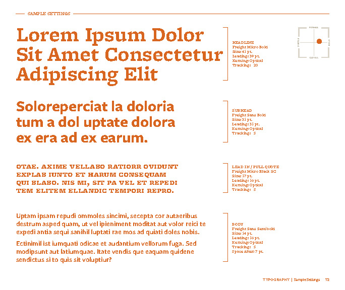
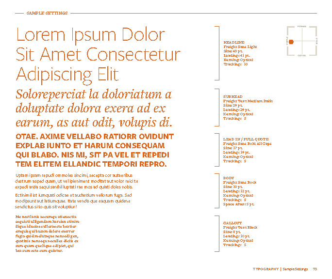
Headline, Subhead & Body Fonts
Make sure to include the font, capitalization, kerning, and line space information for headlines, sub-headlines, and body copy. This will help to ensure a consistent brand experience.
Let’s Talk About Your Brand
shane@3catslabs.com | Call +65-3159-4231
Share